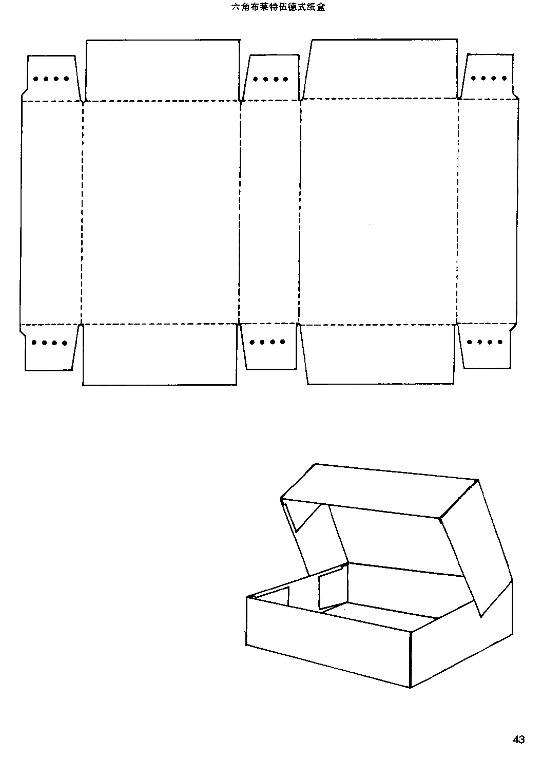
Theses box structures are not the common ones. I shared here for design inspiration. And you can also see some 3D effects of the other structures.
Enjoy


Just another WordPress.com site
Theses box structures are not the common ones. I shared here for design inspiration. And you can also see some 3D effects of the other structures.
Enjoy
1, Color psychology
2, Element design
3, A day for a graphic designer
4, The development line of graphic designer

5, Your web design will give you away
6, Freelance’s chart
7, The reality of the graphic design industry
8, The present situation of graphic design
9, Creative salary
10, Analysis of a graphic designer

This is the second in my series of blog posts exploring the general guidelines or common themes that appear in the genres of science fiction, fantasy, and horror (click here to read The 7 Beauties of Science-Fiction). This whole series started in my science-fiction/fantasy literature class this past Wednesday, when we examined the 7 Beauties of Science-Fiction, we also came up with an original list for the 7 Beauties of Fantasy, and I on my own came up with 5 Beauties of Horror. I thought a series of blog posts sharing and examining these various beauties would be helpful and fun to write, especially when you consider how often the three genres intertwine and overlap.
Now without further ado, here are the 7 Beauties of Fantasy, seven themes or motifs that are found in most fantasy stories, as the examples I pick will show.
1. Character–someone through whose eyes…
View original post 843 more words


The packaging design has a retro feel. And plain regression.
The design is simple and easy, use the appearance of a bamboo pole.
Have a strong sense of design and modeling.

The shape of the bottle using the shape of a light bulb, novel ideas.
Beautiful color and to add strong sense of quality.
Vintage wine bottle shape, the shape of the ancient copper, dark bottle color have strengthened the ancient feelings.


Full of interesting packaging, design can be interesting and full of stereo feeling, give a person a pleasant mood.
 The packing of the West Lake combined the culture of the West Lake water and the broken bridge, the Hangzhou image becomes more strong, and with more modeling idea.
Creative packaging, shoe box with shoes laces as a creative point, let the shoe lace become a shoebox decoration.


The inside structure design enhanced the protection of product.


Rich color, bright eye-catching. Small point of change and the change of the hollow made packaging of a single appearance rich.

Creative and interesting packaging, simple and do not lose characteristics.

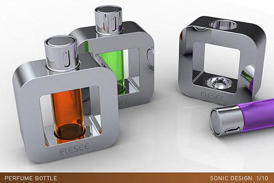
Strong glass textures, increase the smell of perfume and visual impact.
The modeling of simple luxuriant temperament of also do not break.


Translucent packaging allows customers to see the appearance of the goods inside, know the cookies taste, enhance the customer’s taste.


Break the traditional image of mobile phone box, use packing box internal space more reasonable, save costs.

The colorful changes and collocation, outside modeling of the box is a highlight of the packaging, attract the attentions of the children.

A variety of flavors of ice cream, reflects their tastes and the content on packaging.

Chocolate packaging, full of sweet and romantic feeling. Like a book, there are a variety of flavors and easy to eat, and after eating, the collection can be set.


Packing box, in the form of tai chi with wood materials, full of medieval classic lasting appeal. The bottle packaging design elegance, painting with top hollow design is high quality and restore ancient ways.

This kind packaging of perfume is unique, you can tell differences from the colors.
The bottle is very style, color is very bright and different, simple but colorful.

Thought-provoking all kinds of tableware packaging, let people remember that this is a tree, to wake up people of environmental conservation.

Cat food packaging, creative.


Different taste, the bottle appearance with the corresponding color and texture, give a person the sense of fresh.
Make use of the characteristics of the goods combined with translucent packaging, make product become a part of the external packaging, novel and special.


Use headphones line as part of the notes, use headphones plug as another part of the notes, full sense of design.

Packing also adopts the Italian spaghetti, building the Eiffel Tower as the modeling, is very interesting.

Honey around a swarm of bees on the package design, outstanding performance presents fresh and real honey.

The packaging of the flavor materials not only can be used as the sealing, removed can also apply to the bread as a spoon.

Lovely modeling, rich color, is the favorite for girls and children.


Creative packaging bottles, better protect the bottle, has a sense of modeling design.
This is the shirt packaging, save space and material, can reuse, environmental-friendly and clean.


Inside the packing is pictures of animals, with the outside shape indicates the situation of precious animals now, cause people to ponder.
Simple Sarah packaging, can see the content of the commodity, and environmental protection, material- saving.


The design adopts the bump color of popular element, give a person strong visual impact. Simple modeling won’t let a person feel boring.

A. By changing the line to transform modeling technique

B、By changing the box body decent relations to change modelling technique


C、Use paper produces the curved surface

Mimicry design

The handle and the box body one-piece structure

Window

Special form box structure design


As promised, part two of my Survival Guide to NaNoWriMo. Part One, for Participants, is over here. This time, pull up a sideline chair and get the popcorn. Here’s how to make it through the month when it seems like everyone around you is obsessed with plot bunnies and word counts.
1) Breathe. Don’t get caught up in the hype/panic. That shit is contagious. Hang around enough stressed out people and you’ll feel stressed even if you’re not doing anything. Avoid this bullshit—since stress is probably half the goddamn reason you’re not doing NaNo to begin with—and remember to take a deep breath. Or get a drink. Both help.
2) Do Other Shit. Not doing NaNo? This looks like a great time to reorganize your office. Or get a head start on your holiday shopping. Or finally make some headway on the ninja-training-for-dogs program. Bonus points: you get to brag…
View original post 316 more words
We all want a successful design revision can make websites with renewed vigor, not only to attract users, and users are willing to spend more time to browse. To do this, don’t need any mysterious skills. Here will tell you to get your website more popular skill, take that ~
As we all know, appealing illustrations, creative layout and persuasive content can attract users. But sometimes it is not such matter. You may had a similar experience, proud to make the most fashionable page without ideal views. That kind of feeling, you know.
First of all, we first clarify, right page layout should be like this: to induce the audience to explore your site, let them stay on the information you provide, the last to them to take action. Now, get into the business, hope you can get some useful information from this article.
1. Make the users fall in love at first sight
A combination of graphics and content, let the user see admire, produce emotional resonance, are deeply attracted. There are two methods (A) keep the same page layout, lest visitors not to escape. (B) using attracting and high resolution graphics.
Learned anything: create a unified visual experience, use emotional colors and lines, to mobilize the participation of users, combined with compelling content, just enough to give the user a surprise.

More: how to use the shape to make moving effect in the web page
2. Tell stories
We all like the gossip in the break room, at the party. When we share these stories, we give more attention. In that case, why not tell a story on your website? You can draw lessons from the practice of some movie website.
Learned anything: time tested, this is a good way to improve user participation. The key is you must be good at telling stories. Learn some knowledge about information hierarchy, will help you better understand the psychology of audience, let your web design get a higher conversion rate.


More: 30 websites that used visual storytelling
3. Get rid of the conventional
We are always attracted to unusual things. Brainstorming can help you find ways to make your web design to stand out. Start with high-definition graphics and unique format, a good layout absolutely can reinforce your message.
If you always do what others do, you will be always buried in the crowd. However, if your site is different, your message will stand out, get attention. New journey always make people nervous, but must be worth to explore.
Learned anything: when users interact with your site, to leave an indelible impression on them. Like your favorite ice cream flavor is better than other myriad taste, your web page layout should strive to become the audience favorite flavor, and make them want to come back at any time. The key here is study + creativity. Yes, please hold the boundaries between unconventional and strange.

More: 30 unconventional and new website designs
4. Put the important information on the first screen
Network competition under the normal, it is difficult to get new visitors. So, once the user on your site, you must hope that they stay in website longer. Relatively speaking, don’t need to scroll the screen operation, people are willing to spend more time to stay. So the design must be efficient. Wisely make response actions, preferential information or register button on the first page, you can benefit from the user feedback.
What did I learn: the arrangement of information, should let visitors quickly find what they are looking for. Even promote visitors after he found what he needed information, continue lingering on your site.

More: first screen design — the head of web design version
5. Continue improving
Game master also can’t win every time. We all need to practice, fine-tuning skills, to do better in the game. Adjust your website design, make the target audience like, is a gradual process.
Learned anything: continuous improvement of the old concept has been introduced in Japan for decades. To design your website, and then test it, then test again, see what are the most popular pages. Also, you can also find website bounce rate is higher. There is no short way to success.

More: Iterative — not to improve the quality and function of the design
Attached tips: enjoy inspirations like enjoy the beauty. For inspiration, keep creative inspiration and create your inspiration. Google key words such as “web design inspiration”, you will get spewing from countless other web design inspirations. This will help you break your creative bottlenecks. Please bring fun to design, if you are stuck, let oneself catch a breath.
What did I learn: inspire your groceries. In order to find the great idea, sometimes you just need to take a step back. Look at other people’s masterpiece, you are likely to develop themselves, on the other side to discover a new skill. You might not create masterpieces, but there must be a new harvest.

More: 20 web design trends in 2013
Learned these rules? Break them now – that is to create!
If you already have a website or is about to do a website, look at it now. Remove all the interference information, remove affect and dilution reading information content, only keep necessary. When you will be useless after excluding, you’ll get a good website. When you have a place in the heart of the user, they can be hard to leave you now.

Like advertising design, packaging design can sometimes without graphics, but you can not do without text, the text is to convey the essential elements of packaging design, a lot of good packaging design pay more attention to the words, or even completely in text changes to handle the packaging picture.

Packaging text mainly has the following several aspects:
Basic text: packaging brand, name and enterprise name. General arrangement on the versions of the main display, production enterprise name can also be programmed in the sides or rear. Brand font generally make normalized processing, help to set up the product image. Name text can be decorated.

Data text: data text including product composition, capacity, type, specification, etc. Arrangement of parts in the side of the packaging, more on the back, also can be arranged on the front. Design print must…
View original post 324 more words

packmage carton box packaging design software

Your Own 3D Folding Way