Packaging Box Design Appreciation

Corrugated and folding carton box templates

This post is going  to post all kinds of packaging design that I collected, sharing for refresh your eyes. There are bottle packaging design, box packaging design, plastic packaging design. All kinds of, not just specified in box packaging.

I will not say much word here, just relax and enjoy. Get some inspirations.

Packaging Design: 40 Creative Box Designs That’ll Bowl You Over

Packaging design: 45 inspirational examples

PackagingDesign34PackagingDesign33PackagingDesign32PackagingDesign31PackagingDesign30PackagingDesign29PackagingDesign28PackagingDesign27PackagingDesign26PackagingDesign25PackagingDesign24PackagingDesign23PackagingDesign22PackagingDesign21PackagingDesign20PackagingDesign19PackagingDesign18PackagingDesign17PackagingDesign16PackagingDesign15PackagingDesign14PackagingDesign13PackagingDesign12PackagingDesign11PackagingDesign10PackagingDesign9PackagingDesign8PackagingDesign7PackagingDesign6PackagingDesign5PackagingDesign4PackagingDesign3PackagingDesign2PackagingDesign1

View original post

Sheeps by Les Lalanne shot by Peter Funch

Sheeps by Les Lalanne shot by Peter Funch

great inspirations

Red Knit Cap Girl to the Rescue

Design of the Picture Book

RedKnitCapGirlToTheRescueby Naoko Stoop

published 2013 by Little, Brown Books for Young Readers

Naoko Stoop’s work has enchanted me for some time now. I’m thrilled she is in the picture book world because her voice is unique. It’s haunting and heartwarming at the same time. Terribly beautiful. I wrote about Red Knit Cap Girl over on Design Mom, and now she’s back in another lovely episode.

And how thrilled was I to connect directly to Naoko and find out some nitty gritty details of her process, inspiration, and drive to create story? Very. Hope you enjoy getting to know her as much as I have!

Be sure to visit Naoko’s etsy shop if you are still in the hunt for Christmas gifts. I’d take one of each, wouldn’t you?RKCG2-10(Click any image to enlarge. You have got to see the detail and texture in its full glory!)

When did…

View original post 883 more words

Packaging Box Design Appreciation

This post is going  to post all kinds of packaging design that I collected, sharing for refresh your eyes. There are bottle packaging design, box packaging design, plastic packaging design. All kinds of, not just specified in box packaging.

I will not say much word here, just relax and enjoy. Get some inspirations.

Packaging Design: 40 Creative Box Designs That’ll Bowl You Over

Packaging design: 45 inspirational examples

PackagingDesign34 PackagingDesign33 PackagingDesign32 PackagingDesign31 PackagingDesign30 PackagingDesign29 PackagingDesign28 PackagingDesign27 PackagingDesign26 PackagingDesign25 PackagingDesign24 PackagingDesign23 PackagingDesign22 PackagingDesign21 PackagingDesign20 PackagingDesign19 PackagingDesign18 PackagingDesign17 PackagingDesign16 PackagingDesign15 PackagingDesign14 PackagingDesign13 PackagingDesign12 PackagingDesign11 PackagingDesign10 PackagingDesign9 PackagingDesign8 PackagingDesign7 PackagingDesign6 PackagingDesign5 PackagingDesign4 PackagingDesign3 PackagingDesign2 PackagingDesign1

Everyone needs a calendar

Creative Thinking in Graphic Design

bestpackagingdesign

Plane thinking method
The most important thing is – association
Interesting
Marked (stimulus)
Use straightforward rhetoric (metaphor, personification)
Learn how to use exaggeration and deformation

Different associations of the same object

Creative Thinking in Graphic Design1Creative Thinking in Graphic Design2Creative Thinking in Graphic Design3Creative Thinking in Graphic Design4Creative Thinking in Graphic Design5Creative Thinking in Graphic Design6Creative Thinking in Graphic Design7Creative Thinking in Graphic Design8Creative Thinking in Graphic Design10Creative Thinking in Graphic Design11Creative Thinking in Graphic Design12Creative Thinking in Graphic Design13Creative Thinking in Graphic Design14Creative Thinking in Graphic Design15Creative Thinking in Graphic Design16Creative Thinking in Graphic Design17Creative Thinking in Graphic Design18Creative Thinking in Graphic Design20Creative Thinking in Graphic Design21Creative Thinking in Graphic Design22Creative Thinking in Graphic Design23Creative Thinking in Graphic Design24Creative Thinking in Graphic Design26Creative Thinking in Graphic Design27Creative Thinking in Graphic Design28Creative Thinking in Graphic Design29Creative Thinking in Graphic Design30Creative Thinking in Graphic Design31Creative Thinking in Graphic Design32Creative Thinking in Graphic Design33Creative Thinking in Graphic Design34Creative Thinking in Graphic Design35Creative Thinking in Graphic Design36Creative Thinking in Graphic Design37Creative Thinking in Graphic Design38Creative Thinking in Graphic Design39Creative Thinking in Graphic Design40Creative Thinking in Graphic Design4142434445464748495051 5253545556575859606162636465666768

The technique of association
The related properties
The related items or users
More important is to have nothing to do with the imagination
case
1, Water (liquid, color, exaggeration and deformation; the characteristics of the drinker; pollution; dynamic…).
2, Zippers (metal, structure, and expression— mouth, eyes…)
3, Elephants (proportion, vacuum cleaner…).

The use of cartoon characters
The main body to be cartoon
Expression of the cartoon
Reverse thinking
Does not comply with the basic logic
In contrast to the reality
The personification of the animal
The dynamic and static transformation

697071

727374

Creative free is only imagination
In graphic design in order to understand the transformation between graphics and symbols, Exaggerated; Form and word conversion

75767778


798081

8283848586

88

View original post

Toy Packaging Design

bestpackagingdesign

Packaging categories and characteristics
1. The food packaging
To mark the production date and the period of validity, often use the window structure to let the customer directly see the food inside the packaging, or use realistic pictures, or use the technique of expression such as cartoon image.

Toy packaging design1
2. Electronic products packaging
This kind of package with particular emphasis on protection and transportation, always used with combination packaging form to reflect the characteristics of the unit value of the products. Packaging container for hard material, the packing picture often in picture form.

Toy packaging design2
3. The cosmetic packaging
Cosmetic packaging in material selection, modeling and decoration such design aspects, generally pursuit of noble, gorgeous, quietly elegant, pure, or solemn generous the aesthetic feelings.

Toy packaging design3
4. Pharmaceutical packaging
Pay attention to the structural design, safe and reliable images often use can cause health and beautiful legend of abstract shapes and colors. Pay attention to…

View original post 483 more words

What is a gestalt?

Gestalt psychology was born in 1912, is a research team made up of German psychologist who tried to explain the principle of human visual. They looked at a number of important visual phenomenon and compile the directories. One of the most basic Discovery is that human visual is overall: our visual system automatically build structure of visual input, and in the nervous system level perception shapes, graphics and objects that are not only see the edge, line and area. “Shape” and “graphics” in German is Gestalt, so the theory is also known as Gestalt principles of visual perception.

The most important gestalt principles
Proximity principle; Similarity principle; Continuity principle; Closure principle; Symmetry principle; The subject/background principle; The principle of common destiny.
Proximity principle
Proximity principle is the relative distance between the object will affect whether we perceive it and how to organize together. Close to each other (relative to other objects) object seems to belong to a group, while those far away automatically classified as group.

gestalt1

As shown in the above, left in the round in horizontal direction is closer than the vertical distance between each other, then we see four rows of dots, on the right side of the four columns.
Principle of proximity

gestalt2

Two figure cut from different business site index module, although key marked with red in the first picture classification field, but the visual habit or will to as a group, and displayed the actual behavior of the arrangement of repel, when users read cause unnecessary visual illusion. The same content, and figure 2 arrangements done and unified content grouping, as a user, to find the content is more intuitive and clear?

gestalt3

This is two different objects, designers in processing design form done completely consistent, but as a result of middle distance is a clearly distinguish the difference between the two groups rather than one.
Similarity principle
If other factors are the same, then looks belong to a group of similar object.

gestalt4

Each dot in the distance is the same, but we habitually put the same shape of the concentric circles as a group
Similarity case theory

gestalt5

Each module appearance consistent, but the first distinguish it from others on color, which can keep things tidy and give users intuitive feel grey screen and green let show different features.

gestalt6

Shape, spacing, the first obvious difference between the content of the other area, so natural on the vision we separate it into a group and a few other into a set. When doing activities page layout can be put in accordance with this rule? Still use to scratch the scalp to each module should be highlighted to classified these problems?

gestalt7
The same user registration page, it is pure color guide on what is special for the currently executing regions indicate? Obviously it’s the latter, people’s vision will automatically fill color of the same category, and the special blocks will be stripped out. Designers have you noticed the details?

gestalt8

Due to the different alignment will take figure 1 parsed into a column on the left side of the word, the right is a text box parsed into a column, apparently easy to appear when users are using optical illusion.
Continuity principle
Visual tend to perceive continuous rather than discrete, in the form of fragments

gestalt9
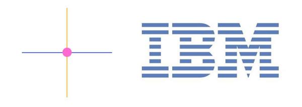
The left, we see two intersecting line is blue and orange instead of four line with a dot, you can see the picture on the right is some scattered blue line or IBM three letters? Is three letters, of course, your vision is interested in to discrete pieces form a whole.
Continuity principle

gestalt10
After watching this picture what you feel? The designer figure no place to place, so that the user can’t see all content? Not too! So not only will not affect the visual effect of composition but increase the extensibility of the page, visual intentionally organize the imaginary overall discrete element to be reckoned with. In the main image geometric also narrow all displayed on the page? Boldly cut corner of the main content to show enough, visual impact is stronger?
Closed principle
Visual system automatically try to open the closed up, and its perception as a complete object rather than scattered debris.

gestalt11

Our visual system strongly inclined to see objects, so that it can be a blank area parsed into an object, so we see the picture above shows a circle rather than multiple line segments.
The principle of closed case

gestalt12
We often use the same shape in overlay to display items to full screen, scene of quasi real effect.
Symmetry principle
We tend to break down complex scenarios to reduce the complexity.

gestalt13
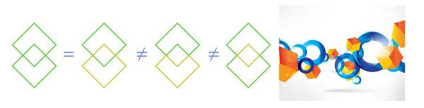
We used to put the above parsed into the combination of two simple symmetrical shape, put on the right side of the two-dimensional geometric figure parsed into three dimensional surface.
Symmetry principle

gestalt14
Worry about your project scene with no feeling? Demand that your button is too flat “like button”? Draw the superposition of several surface is above the seemingly high-end western style big stage effect?
Subject/background principle
Our brains visual areas can be divided into the subject and background. Main body includes a occupy our main attention all elements in the scene, the rest is background.

gestalt15
When we used to put small objects overlapping the as the body of the background.
Main body principle case/background

gestalt16

Commonly used in the main display content in the page design “after” placed impression induced background, to pass information to suggest that theme. Met a demand of ash content is often much more atmosphere, the content general arrangement, the essay also is pretty good handling in the background?

gestalt17

Over and above the other content are often used to popup information, as the user attention focal point, the content of the new information briefly as a new subject, relatively Yu Zaixin information substitution, pop-up can help users to understand their mutual environment.
Common destiny
Associated with proximity, similarity principle of eternal life, whether can affect our perception of an object group. Points out that the movement of objects with perceived as belonging to a group or are related to each other.

gestalt18

Spacing size same color graphics, visual graphics will put together are divided into a group.
Principle of common destiny

gestalt19

Sports can’t use static diagram of the illustrations, only hint at work in the same group to convey information, give it to show the same activity rule of form. Such as the same function button HOVER effect, unapt let users can’t distinguish the similar options. Folder, drag the selected folders to appear at the same time when the white background and trajectory is the most intuitive interpretation principle of common destiny.
PS: the full text is reproduced in a web site I see! For we do design, gestalt principle on the page layout is really useful!

THE UNCHANGEABLE SPOTS OF LEOPARDS

9780670026005_Unchangeable_JK.indd

(Viking, 2013)

When Alison Forner’s brilliant cover design for my debut novel The Unchangeable Spots of Leopards first came in to my editor’s desk she sent an email to me and my agent with the subject line, “You guys.” And then, “I have a cover to show you. For your book. For serious.” And that was pretty much the exact same breathless reaction that I had, after bolting up to my wife’s office, where Viking had messengered a copy. (I asked them to send it there because I didn’t want to open it without her, for fear I would pass out alone in the apartment by myself.)

There’s something elegant and simple about the cover: an off-white background almost like a blank piece of paper, and then these brightly-colored typewriter keys hovering over it as if to spell something out in code. The “spots” give some context to the title, and at the…

View original post 846 more words